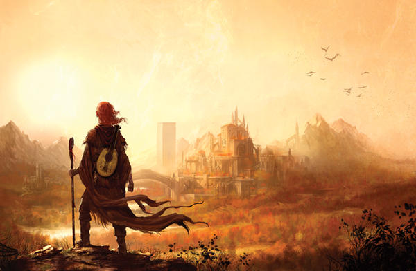
I love vibrant colours, especially in nature – sunsets and sunrises, trees in the spring and autumn, glacial water with the sun's reflection glittering on the surface, and so on. It's why I love landscapes, and artists like Monet. It's not just using vibrant and natural colours for the sake of it that appeal to me, it's using a scheme of colours that work together and suit the concepts you're trying to convey.
With all of that in mind, here are my five favourite fantasy covers.
Stormdancer by Jay Kristoff

I absolutely love the colour scheme. There is a sharp and vibrant contrast between red and black, but a whole slew of subtle tones to each. The red of the lotus flowers with what I assume to be the implication of blood stains, the woman's tattoos, and the accent in the clouds work so well together. Then there's the blacks and greys of the woman's hair and clothing, and the dark grey mixed with, I think, a bit of blue for the clouds in the background. The style seems to mix Japanese art with modern, western fantasy art (not that I'm an expert on either, so I could be flat wrong on both accounts) and it does so superbly.

The use of colour here is much different. Everything is far more subtle and more natural, but feels so natural and appropriate that I absolutely adore it.
Name of the Wind by Patrick Rothfuss

This is a perfect example of a cover that, to me, suits the book itself. The relief of the mythical creature's head, the slightly darker tones to the colouring of the leaves, and the appearance that the leaves are being scattered by a gust of wind – possibly from the mouth of the creature – it all works for me. The colour of the background, that is either stone or wood, also really suits the contents of the book, and especially the third-person parts that take place in a small village tavern.
And, of course, like with Stormdancer there is an alternate cover style that was used in the Brazilian edition of The Name of the Wind. To me, it best reflects the nature of the series: the epic scale, and Kvothe's wandering and musical soul that defines his character.
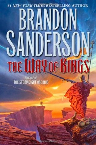
Way of Kings by Brandon Sanderson
I suppose its no coincidence that two of my favourite books both make this list, and I wonder which way it works: do I like the covers more because the book itself is so good, or does the art help me like the book even more? Or is it purely coincidental? There are numerous cover styles for The Name of the Wind in particular, and there are many that I don't really care for.
Range of Ghosts by Elizabeth Bear

I like the wisps of smoke, coloured with a mixture of blacks, dark blues, and purples. I like the figure astride the horse, the larger figure among the smoke holding a bright jewel that is also the moon, and the stars that filter through. There is a special significance of the moon and stars in the mythology and lore of the series, so seeing them worked into this cover art is very appropriate.
Under Heaven by Guy Gavriel Kay

The third Asian-themed fantasy book whose cover cracks my top five, this one presents a different style from the other two, which are themselves different than each other. But they are all fantastic. This one is much simpler, using different tones of green throughout. The stone head of the horse is very relevant for the plot of the book, and the subtle blending of the Chinese-style symbols and letters give you an easy idea of the inspiration Guy Gavriel Kay drew for the story.
No comments:
Post a Comment